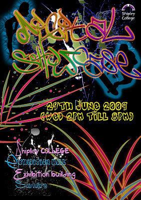
 I created this poster as my first idea, but then realized that it didn't seem enough to be picked by the group. So i changed the picture setting from landscape to portrait to see if it looked any better.
 This was my second attempt, i tried to make it look as real as it could be, however after evaluating i and my course tutor decided it was only atrracting females attension. So my next step was to make it more of a unisex poster which will attract males and also female.
 This is the final poster which i decided on; however after looking at it through with the class, it was decided that i had to shorten the address to make it less complicated but also the poster will look a bit thinner (in the sense of text and pattern).
As you can see i have changed few of many things in this poster from the previous poster. I have changed the colour of DIGITAL SHOWCASE and also changed the way it looks, by changing the brush tools to make it more obvious for people who may not be able to read what it says. I have also changed the colour scheme of the adress, as you can see it was pink and white, where as after i chnaged it i did it blue and white, so balance the colours out.
 This is what i am currently working on. I have changed the splash behind "Digital Showcase" and also changed fonts and colours

No comments:
Post a Comment